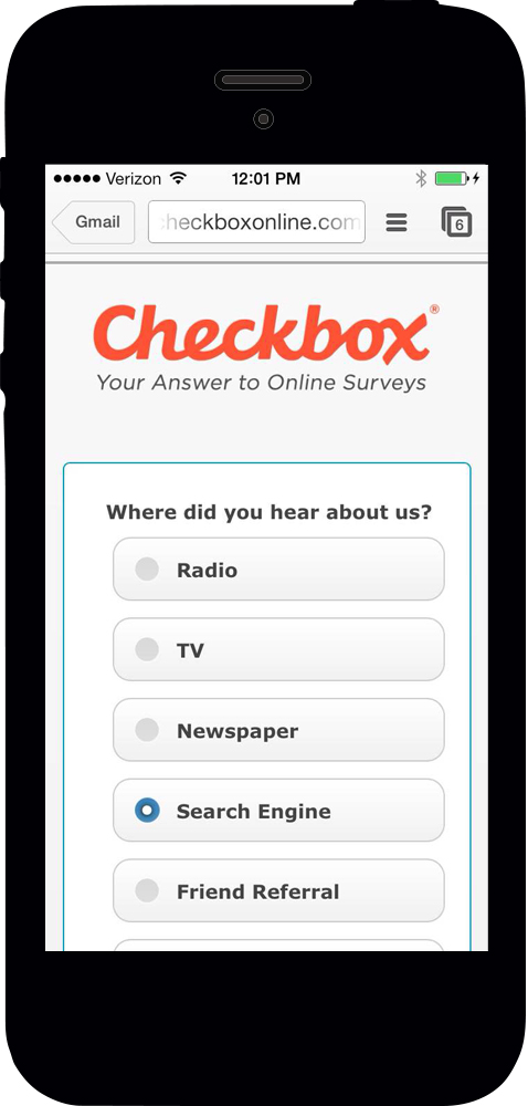
We're in the final stages of QA on our latest version of Checkbox Survey, which will include some major upgrades for mobile online survey takers, as well as few other minor enhancements. So, without further ado, here is your version 6.4 Sneak Peek:
Feature #1: Mobile Style Templates Replaced by jQuery Mobile
Previous versions of Checkbox Survey used a mobile browser detection feature to detect that survey takers were using a tablet or smartphone, and then applied the mobile or tablet style template specified by the survey creator. As of version 6.4, this feature has been replaced by the jQuery Mobile framework.
What is jQuery Mobile?
In a nutshell, jQuery Mobile is a web framework that will allow your surveys to scale and look awesome on almost any mobile device, including all major smartphones and tablets.
Why did we make this change?
Simply put, jQuery Mobile makes your surveys look a lot better on mobile devices and greatly improves the mobile survey taking user experience. Fonts will auto-scale and question buttons, boxes, and sliders will be optimized for mobile devices.
Here's what mobile surveys used to look like in Checkbox:
What will mobile surveys look like in version 6.4?
As we mentioned, you won't have to create or apply mobile style templates in version 6.4+. You can apply a style template to your surveys and your template will be applied and be automatically scaled to your mobile surveys. To decrease the strain on mobile data plans, we've also added the option to hide your style's headers and footers when a mobile device is detected - this feature is found on your survey's Appearance tab.
If you don't want your mobile users to see your standard style template, you also have the option of using our new pre-configured, mobile themes.
Here's the same survey we showed you above, optimized for mobile in version 6.4. These examples use a custom style template with a header, a custom style template without a header, and a mobile theme.
Custom Style - Header Custom Style - No Header Mobile Theme
What does this mean for your current and new surveys?
Existing Surveys - If you are using mobile or tablet style templates, these templates will be removed with version 6.4 and the "PC" style template assigned to each of your surveys will now also be applied to surveys viewed on a mobile device. If you did not assign mobile or tablet style templates prior to the 6.4 update, your mobile surveys will continue to use your assigned PC style template. We highly recommend that you test your surveys on a variety of mobile devices to ensure they look the way you want them to. If you aren't happy with the way your style templates look in version 6.4, you can choose to assign one of our new, pre-loaded mobile themes, available on the Appearance tab of the survey editor.
**If you have any headers or footers in your current mobile/tablet styles, you will need to save these outside of Checkbox before the update.
New Surveys - You can apply a style template or a mobile theme to your new surveys. We always recommend testing your surveys on a variety of devices and browsers to make sure you're happy with how they look.
Feature #2: Response Statistics Tables
Reports have been enhanced with the option to include summary and detailed response count tables below each summary chart.
Feature #3: IE 11 Support
Checkbox 6.4 has been modified to fully support Internet Explorer 11 for both survey design and taking.


0 Comments